
Family Hub
The problem
After the pandemic, travel interest surged, and Visit California wanted to make trip planning easier for families. While the site offered plenty of content, it was hard to navigate and didn’t support deeper exploration of destinations.
The objective was to create an engaging, user-friendly platform that blended inspiration, entertainment, and practical tools to help families plan real trips to California.
The process
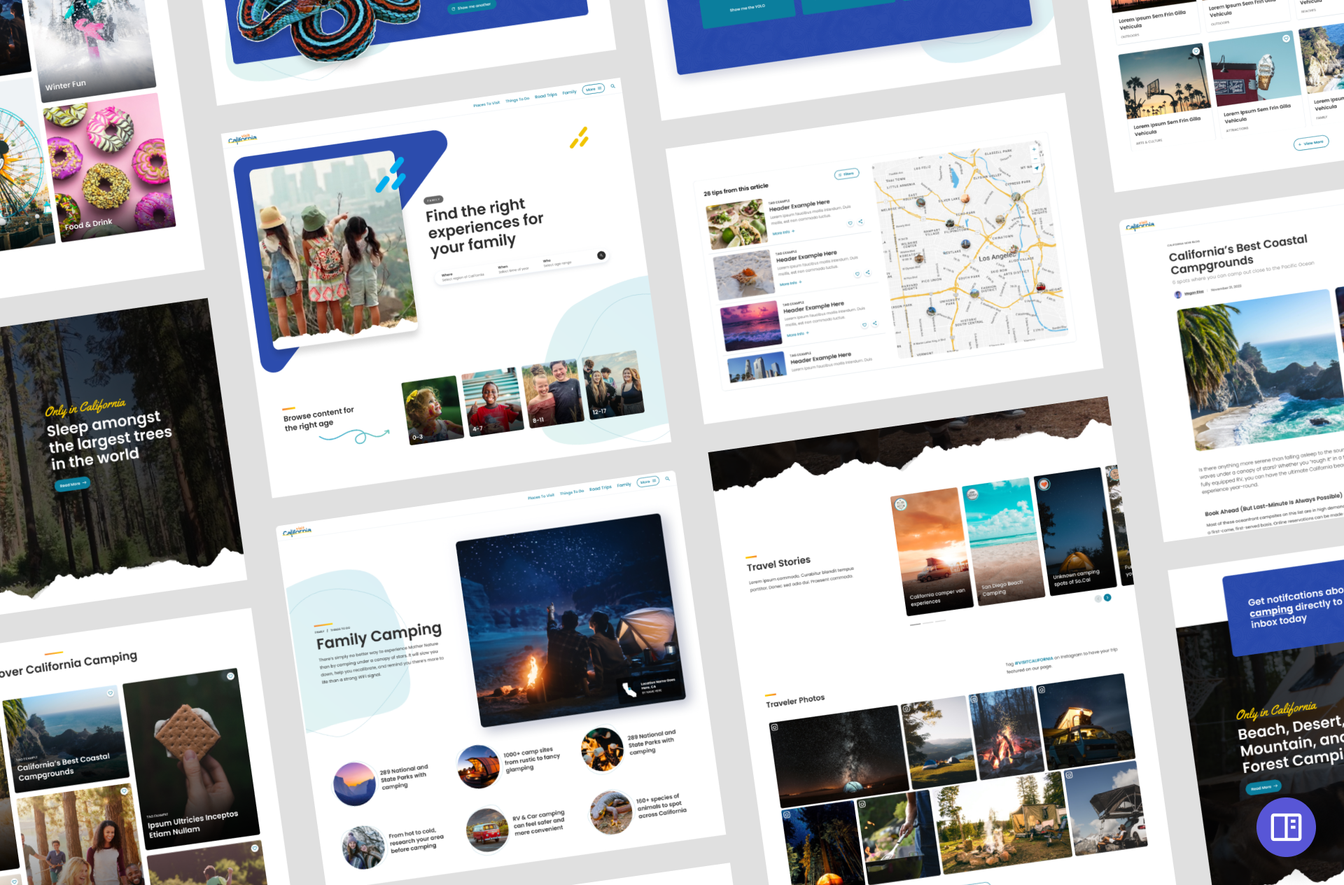
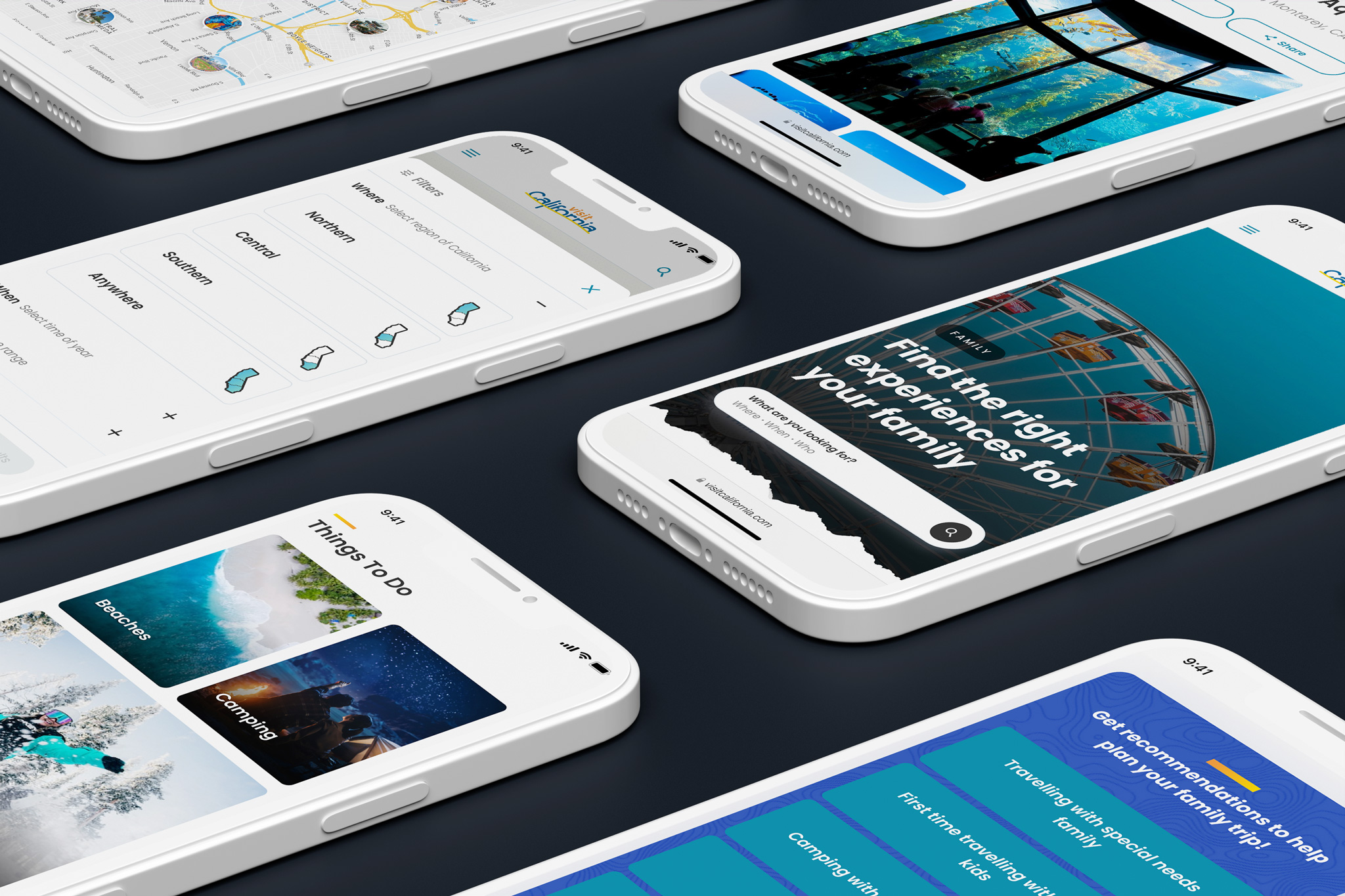
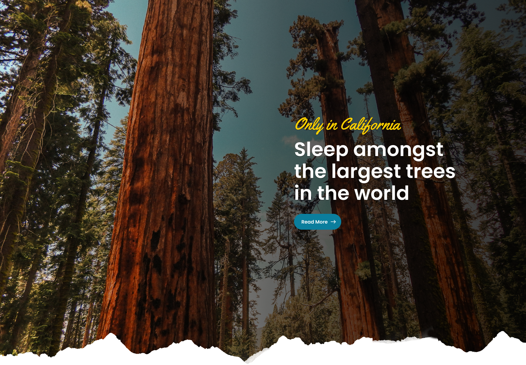
The core concept revolved around a landing page that guided users with clear browsing paths to key topics.
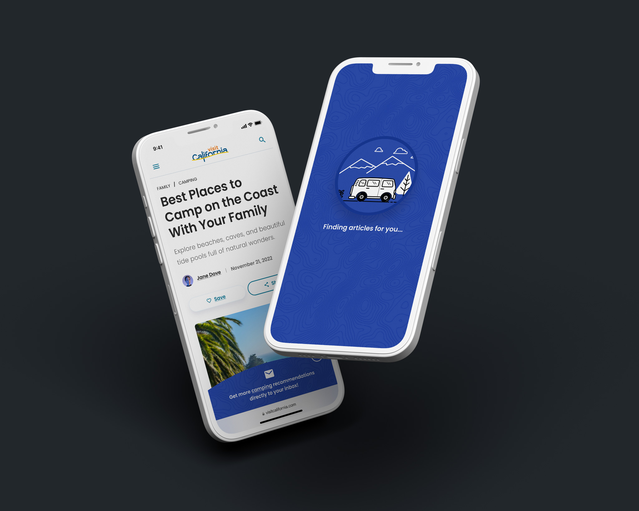
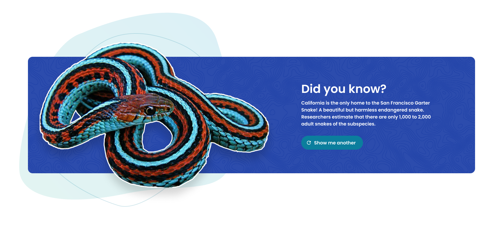
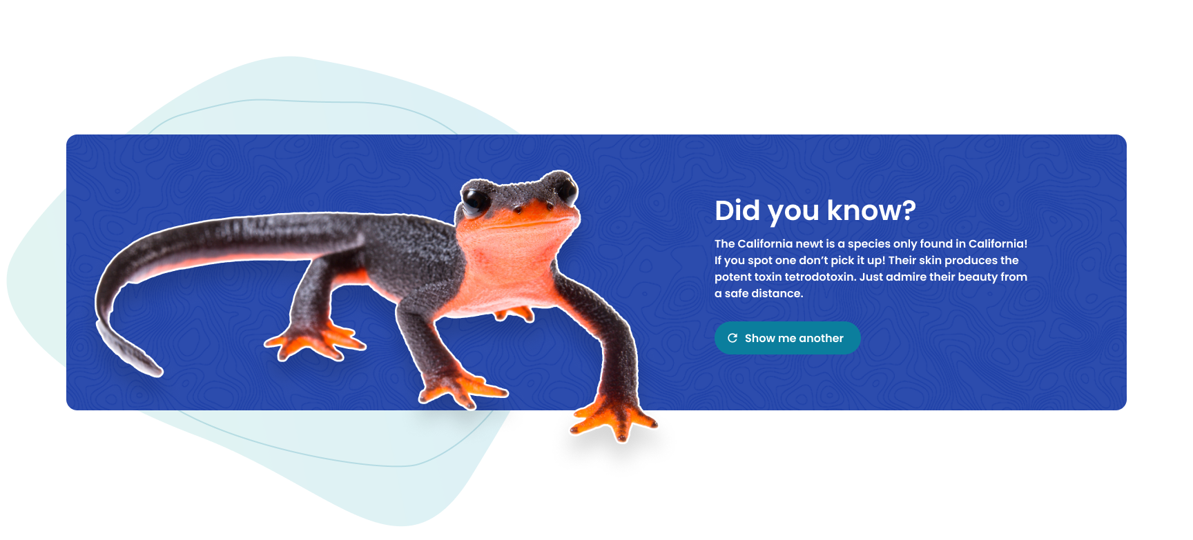
Topic pages provided visually engaging, high-level overviews on subjects ranging from camping to theme parks and eventually articles for in depth reading. However, it did not end there. Atomized content allowed for in depth planning and learning.
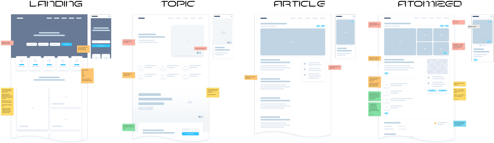
In our design articles are no longer just endpoints—they now serve as gateways to further exploration.
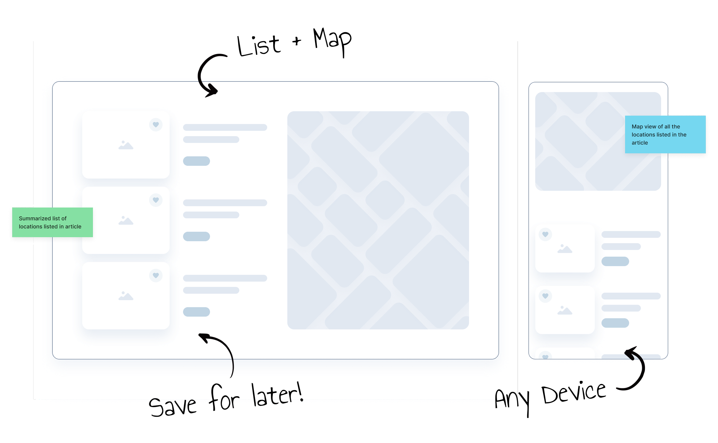
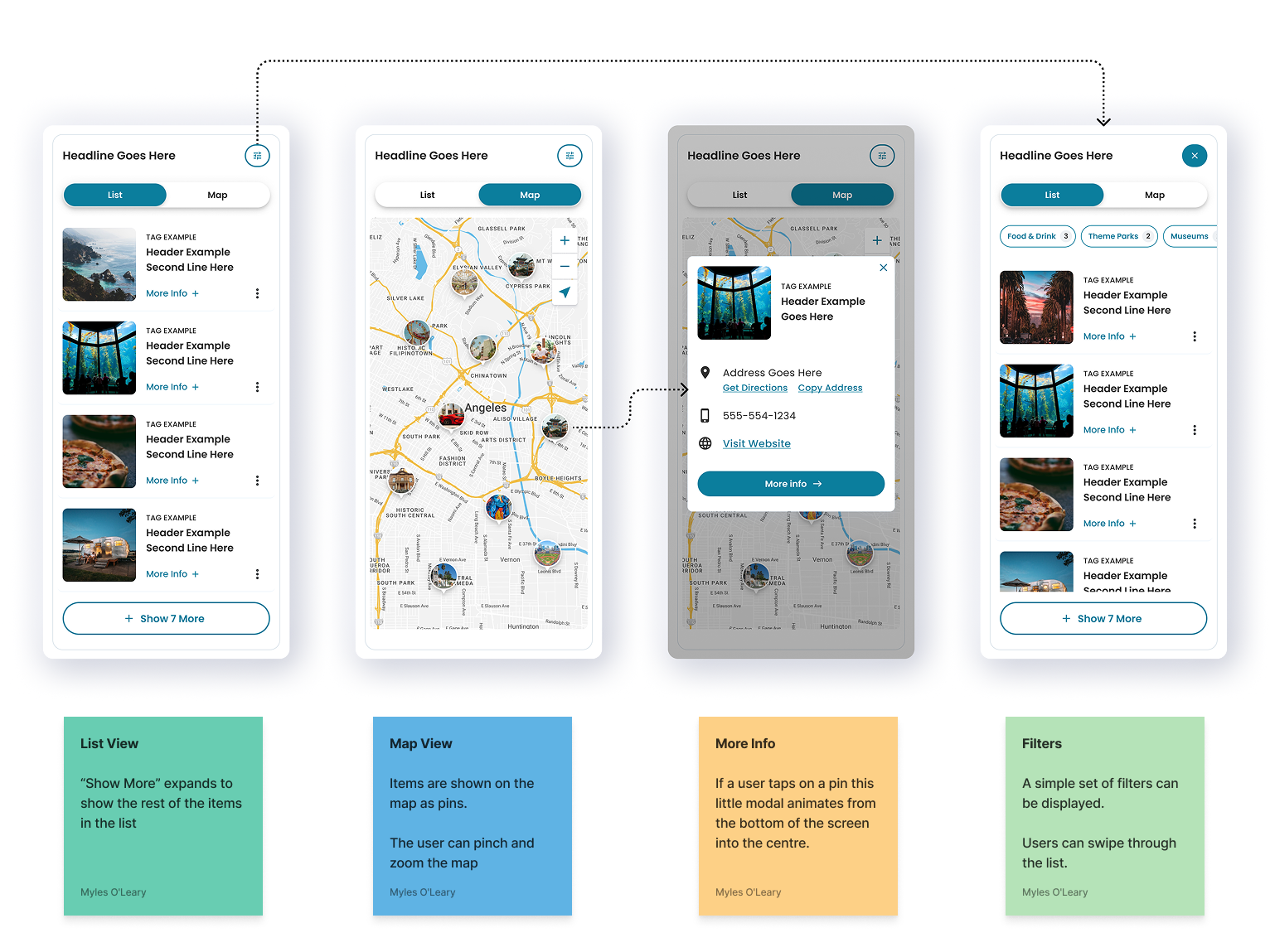
Articles lacked organization, with destinations buried as hyperlinks within the long form text of the article. Our experience design elevates these locations, featuring them in a dedicated map component for a more practical and interactive planning experience.

The Outcome
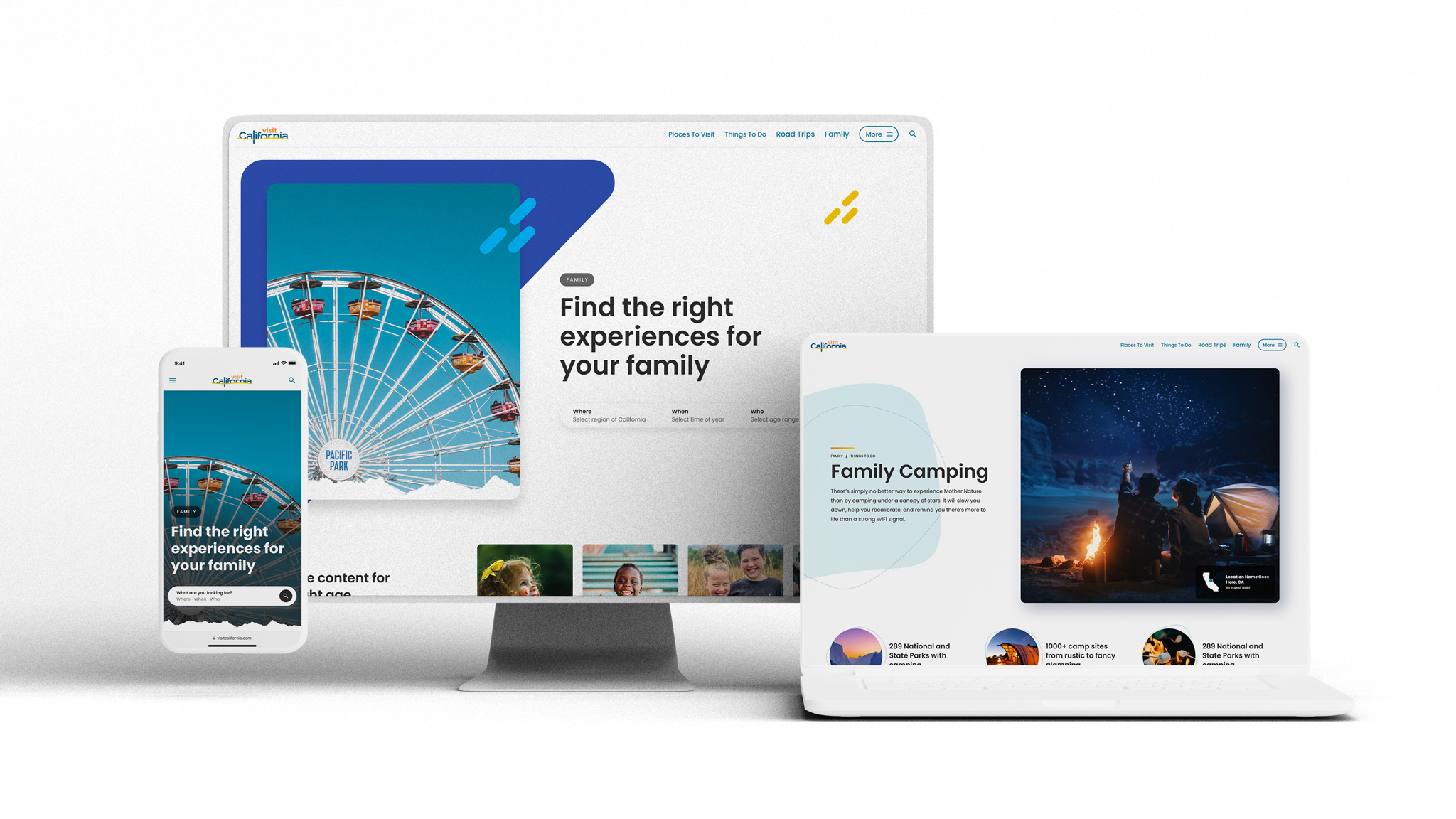
A mobile-friendly, intuitive, and helpful learning tool.
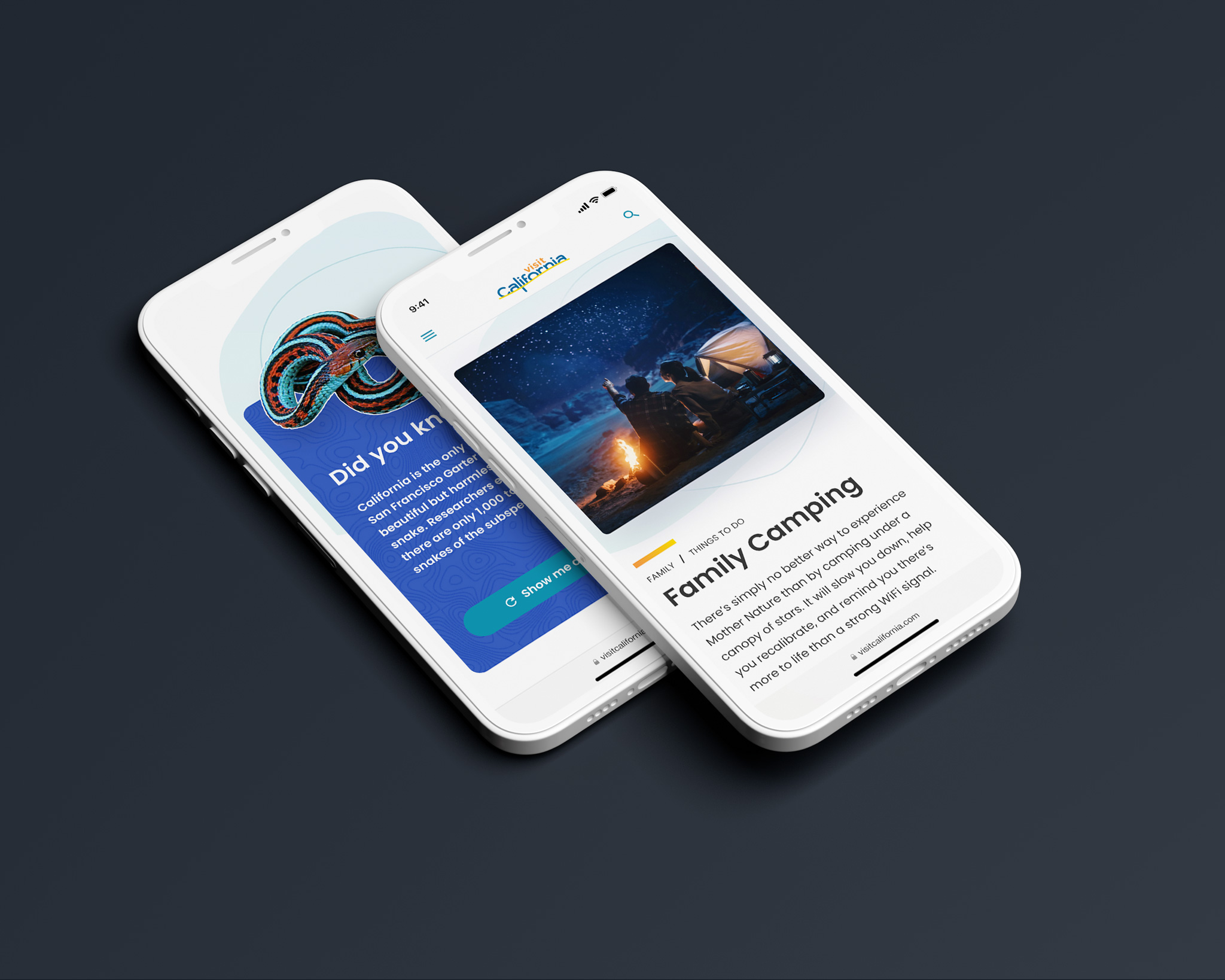
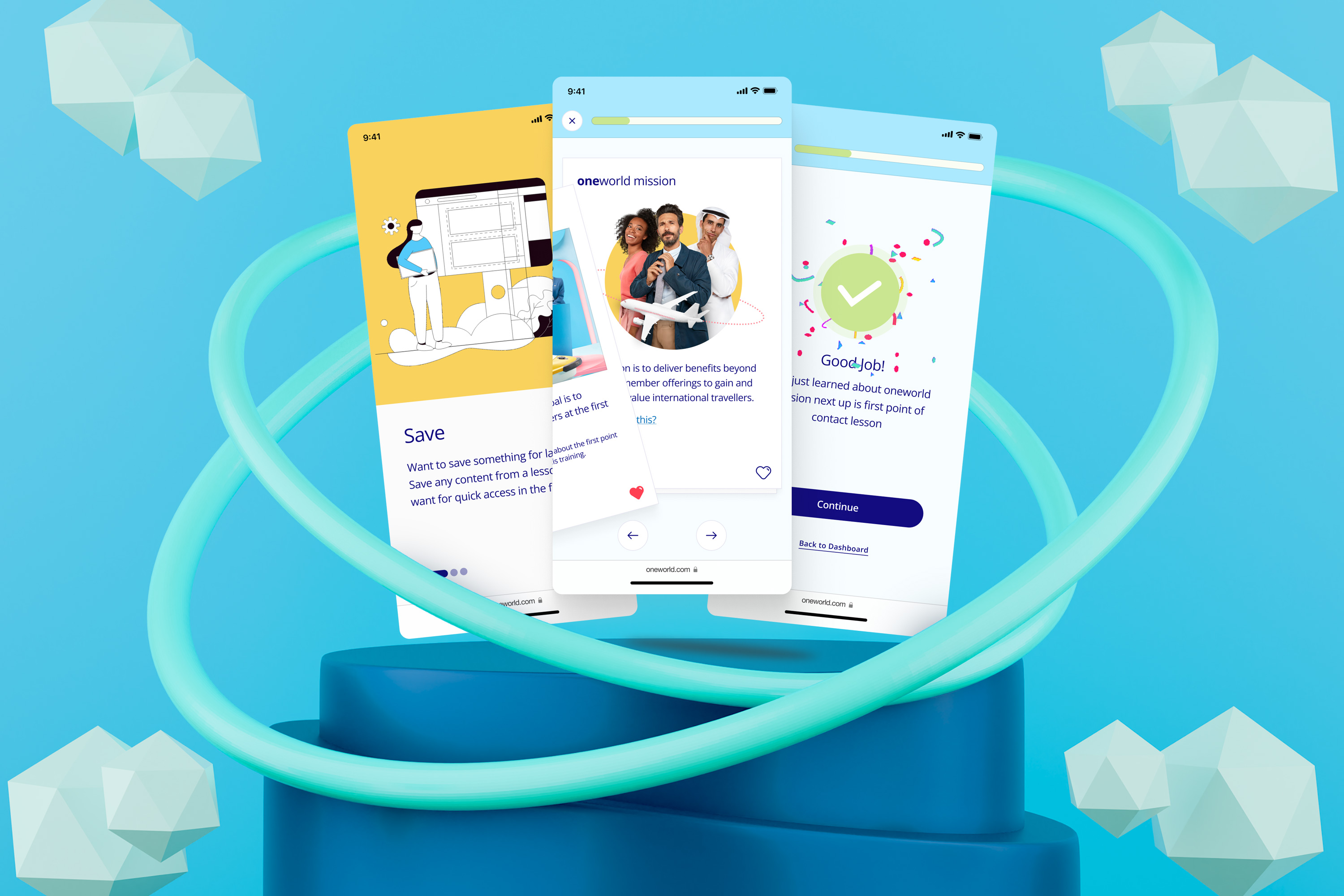
Interactive Learning
Sidebars & Modals
A layered design kept the main experience focused, with extra details accessible through modals and sidebar drawers.

Contact
Have a user experience or user interface challenge you're looking to solve?