
TCL — 2018 ReDesign
The Results
Higher User Engagement
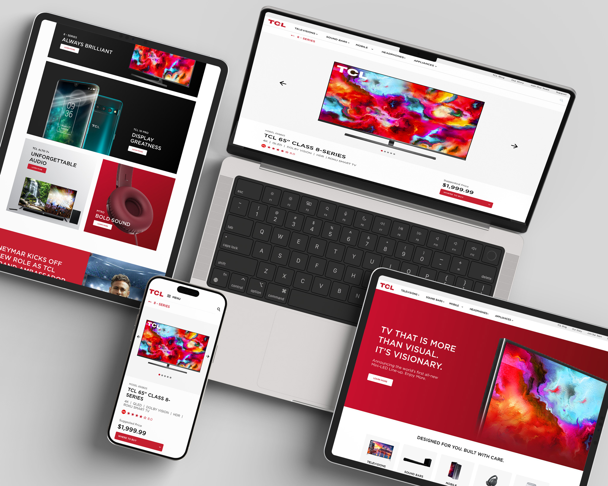
Visually based mega-nav made site easier to explore
Increased Brand Perception
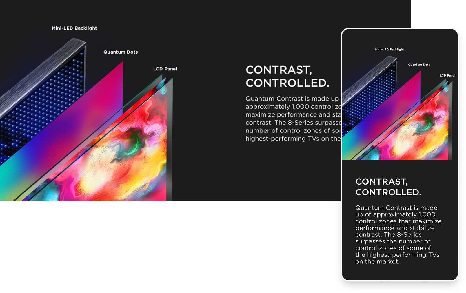
Fresh design reinforced TCL’s global rise
Supported Growth
Helped support TCL’s 12% global TV sales growth in 2019
The problem
TCL had recently updated their digital style guide with a fresh minimal colour palette, a new font, and a few UI elements. It was a solid start but they felt their test mockup was too heavy and dense and lacking the friendly, approachable feel they wanted.
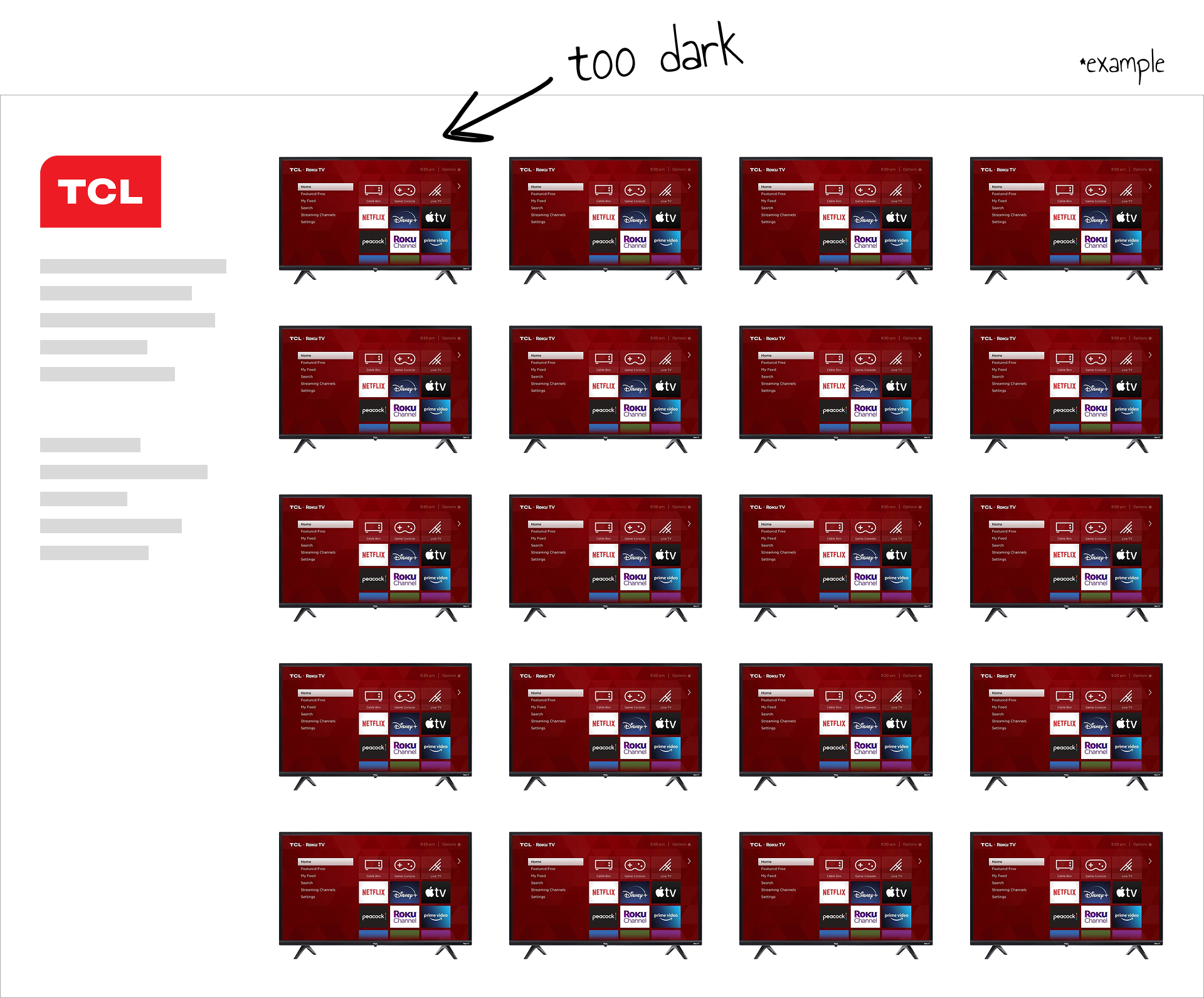
Another issue we identified was the repeated TCL x Roku images—dark and heavy, they dominated pages with up to 25 identical thumbnails, making the layout feel dense and repetitive.
The PRocess
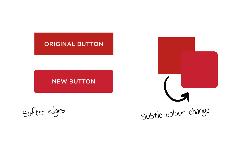
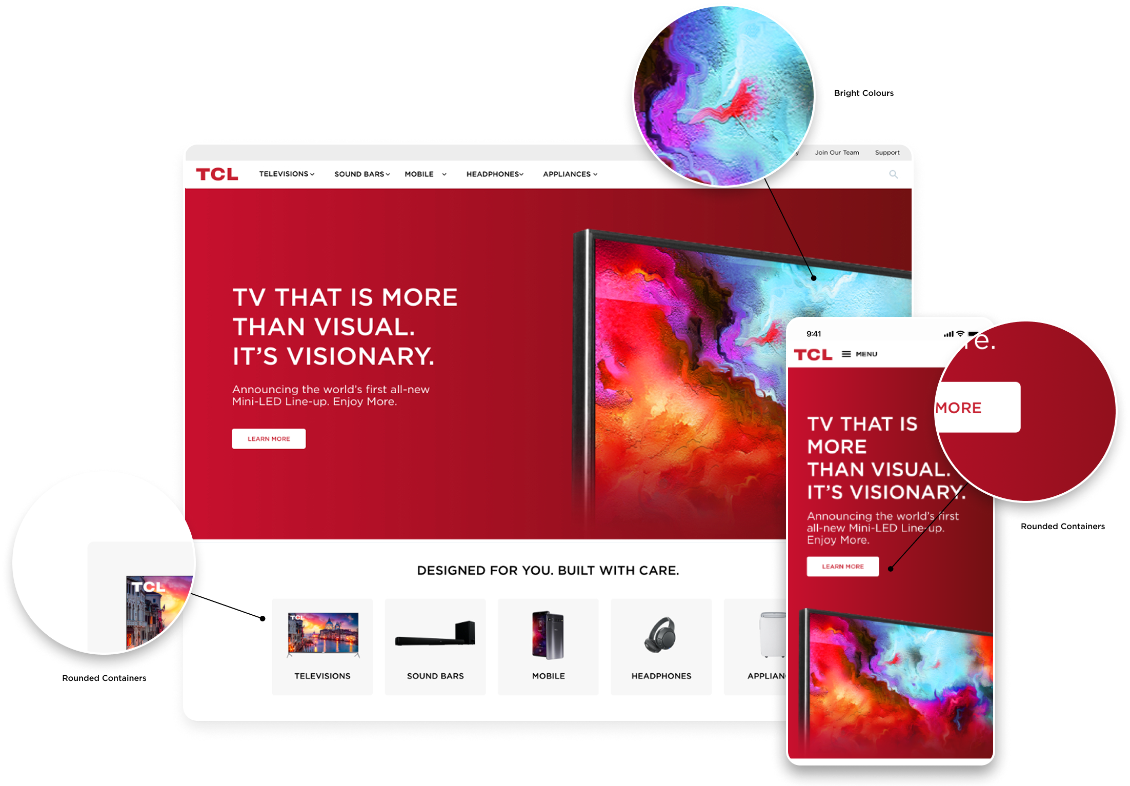
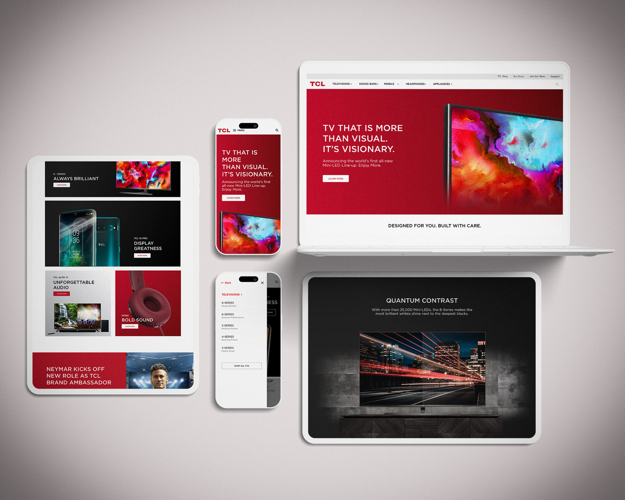
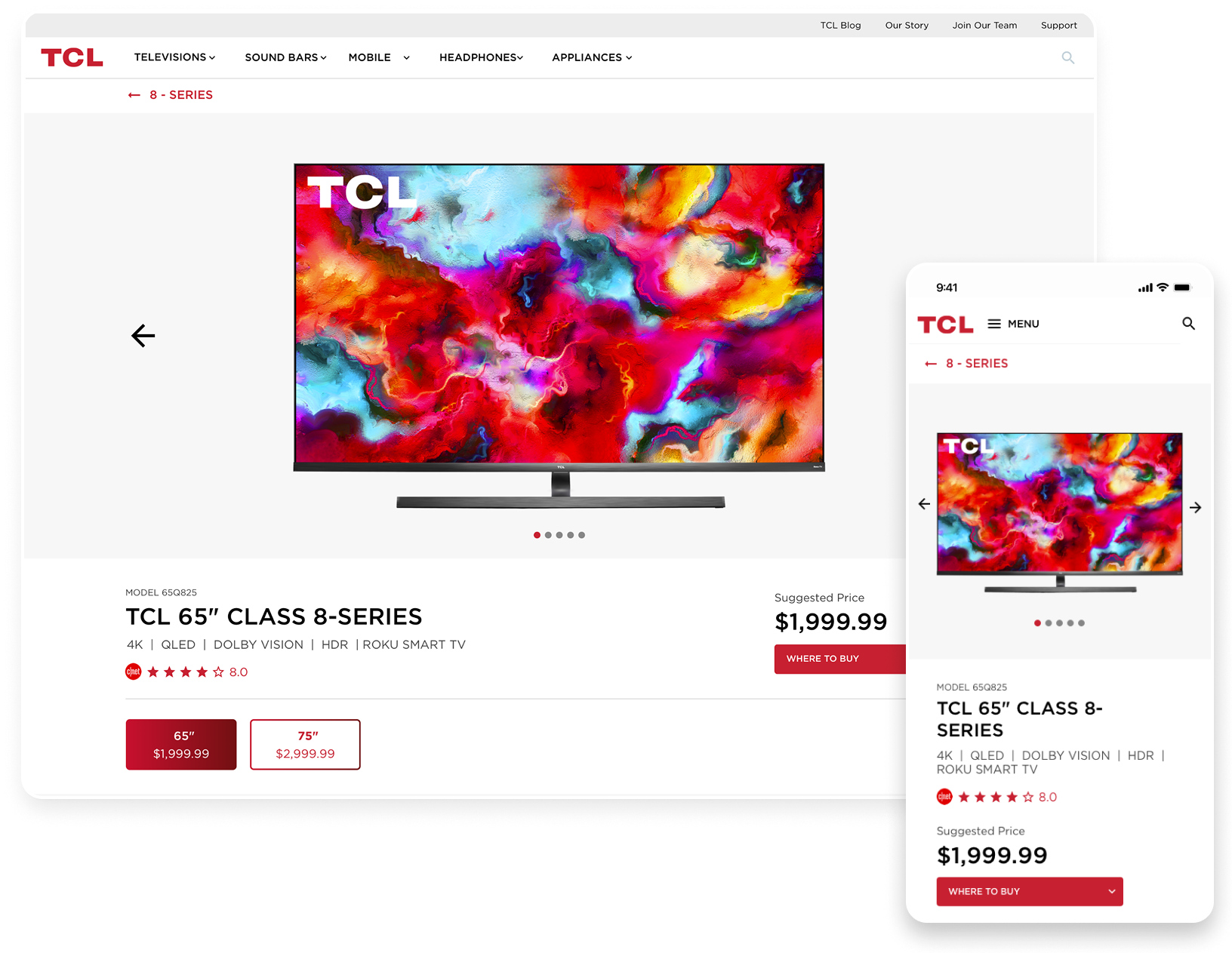
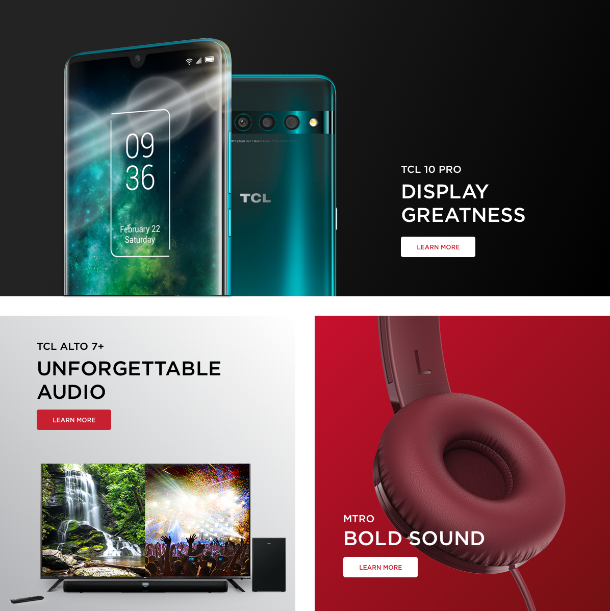
We brightened the red, softened UI elements with rounded edges, and replaced repetitive maroon screens with vibrant imagery to sell the TCL experience.
As well, we added high-quality lifestyle photos of TVs in well-designed spaces that elevated the brand, making the experience feel more premium.
The Outcome
The 2018 redesign remains largely unchanged, with only minor updates over the years. The design continues to be a vibrant, engaging experience that makes it easy for customers to explore TCL’s products.
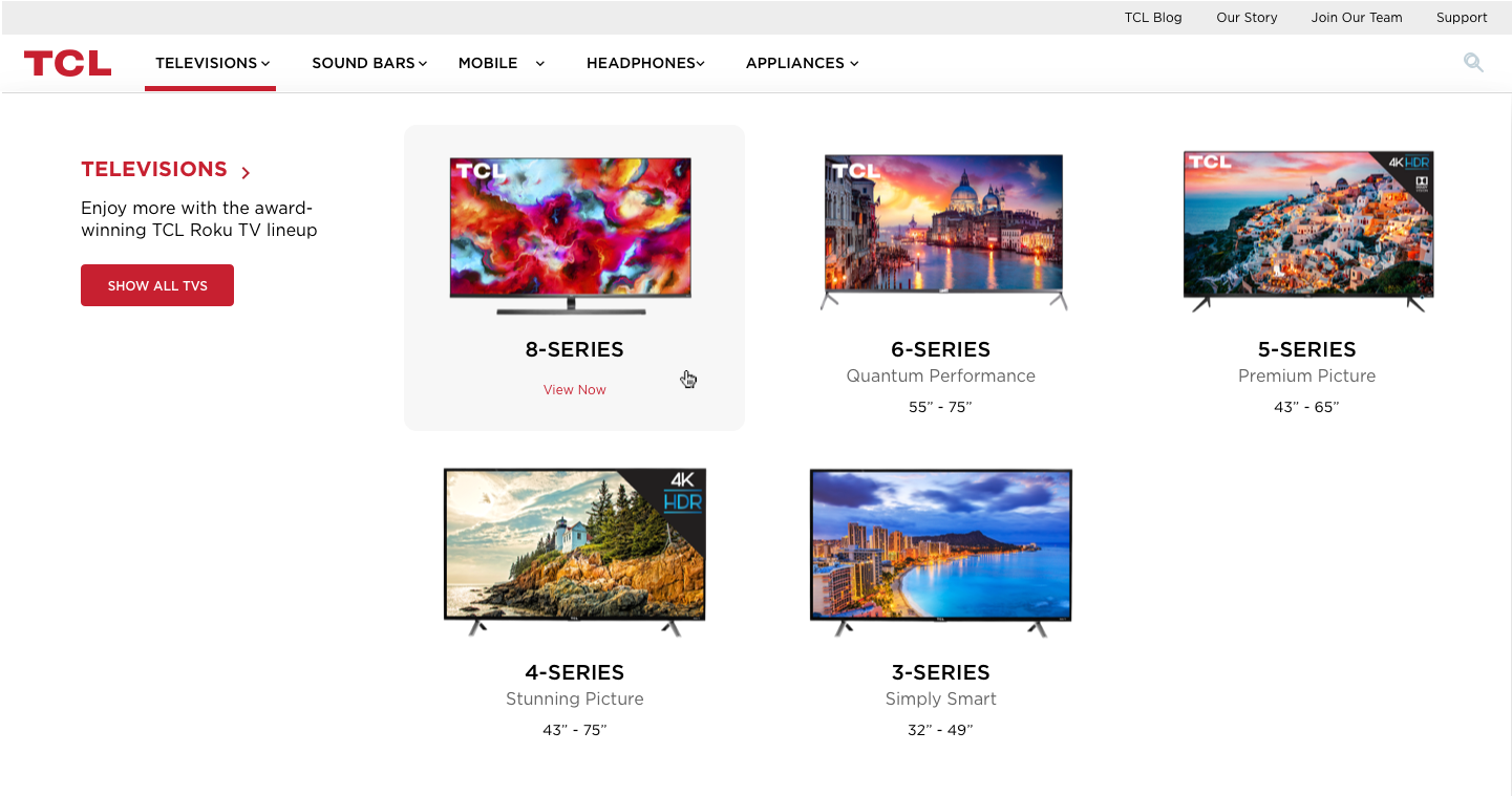
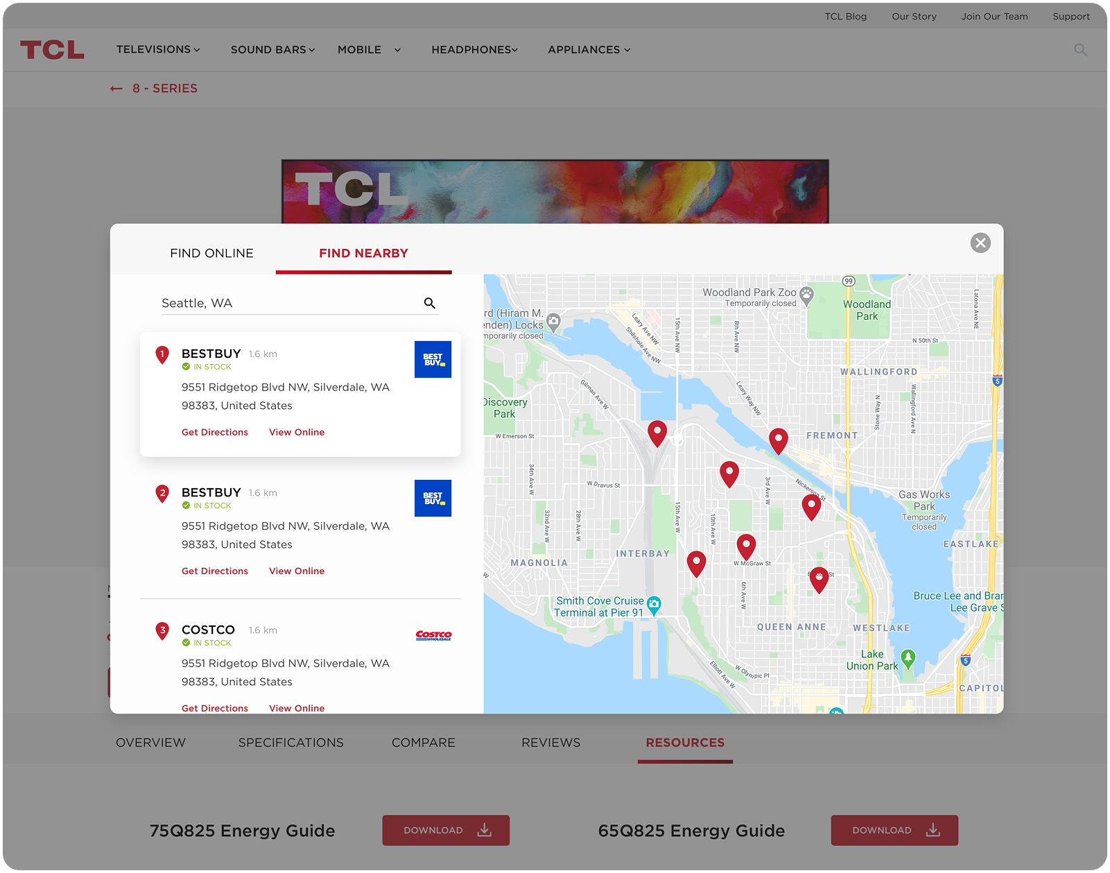
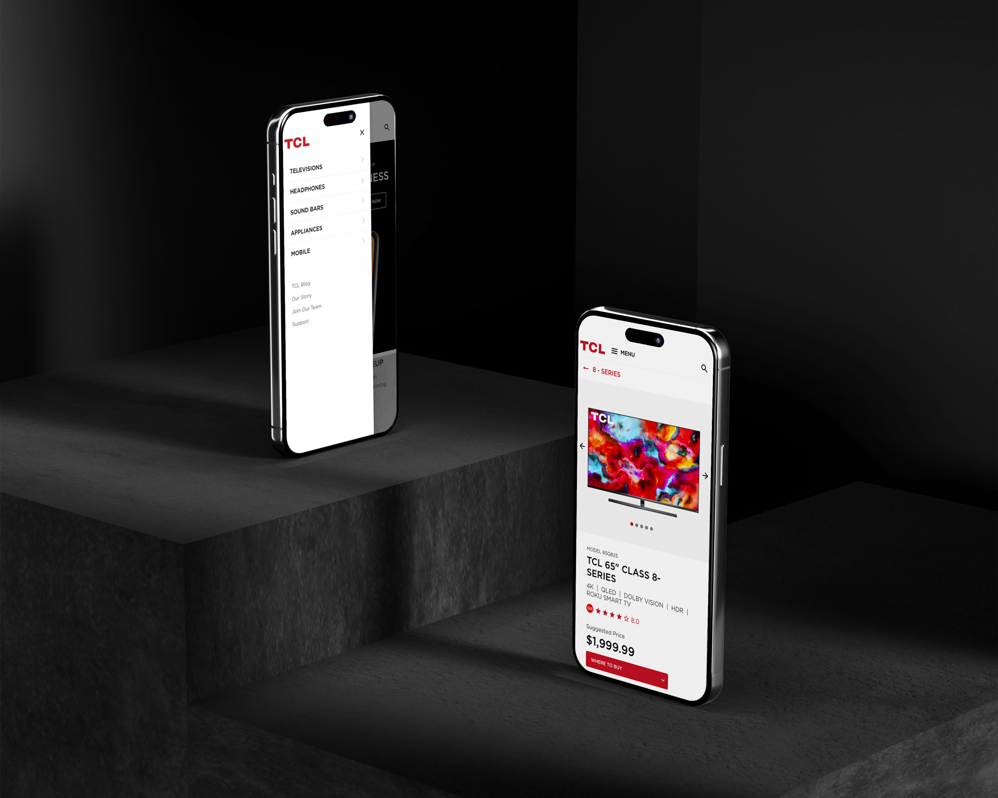
The Mega Nav
We transformed the navigation into an intuitive mega-menu that simplifies browsing and highlights the brand’s product range in a more visually engaging way.

Contact
Have a user experience or user interface challenge you're looking to solve?